Rivoli Theater
Season 2015/16 Posters
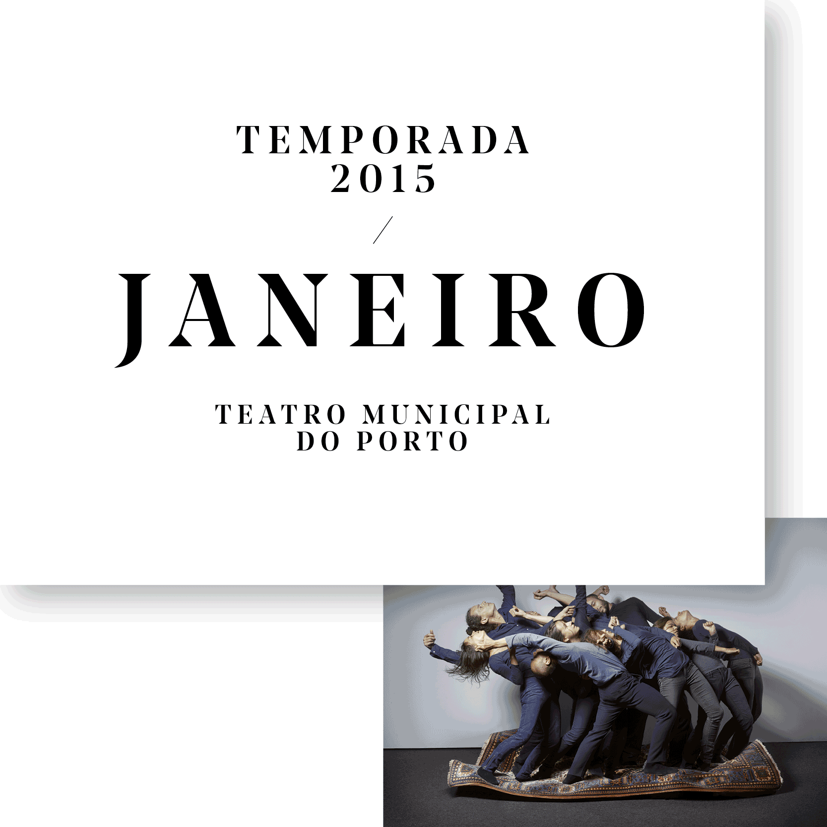
The new Porto City Theatre (Teatro Municipal do Porto) reopened January 2015, with a strong new focus on contemporary dance and a new visual identity designed by White Studio. We approached the visual identity using a very classical type that would illustrate the clash between the history of the theater and the new bold approach of the new director. The new Rivoli wanted to showcase its cultural mission in the city with a contemporary attitude throughout its program.
Using references to printing and trim marks, we see the posters as layers. Sheets of paper overlapping and mixing together in one slightly surreal layout.
The result is a mix of classic typography with layers and layers of colours. We have multiple layers of posters inside one single frame, creating a complex system of shades. The strong and classic typographic system allows us to quiet down the layout and give it a solid structure that is maintained throughout the various communication materials.
These are some of the posters that resulted from the new visual identity.


Studio White Studio
Creative Director Eduardo Aires
Graphic Designers Ana Simões, Oscar Maia
Client Porto City Theater
Year 2015